
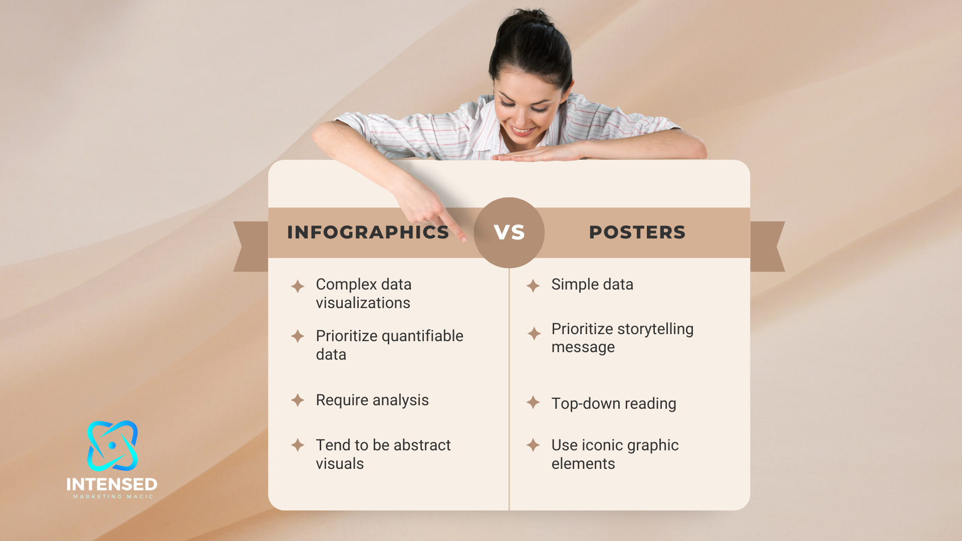
In today’s world overflowing with information, visual mediums have become extremely popular for communicating ideas and data more efficiently. Two such mediums—infographics and posters—are commonly used across industries and contexts.
But with different formats come distinct advantages and limitations. So which one is more effective for your goals?
In this article, I compare infographics and posters across key criteria to help you determine the best visual medium for your needs.
Breaking Down the Key Differences
Before analyzing the specific use cases of infographics and posters, let’s look at how they differ across three vital aspects:
Length and Depth of Information
The most fundamental difference between infographics and posters is the length and depth of information they can effectively communicate.
As graphical posters need to convey a message quickly with visual dominance, they use minimal text and simplify complex data sets. The limited space—usually a single printed page—constrains the detail and length of the content.
Infographics, on the other hand, have much more flexibility with length, using the power of visual storytelling to engage users in detailed data stories. Quality infographics strategically balance text and data visualizations to provide more context and supporting evidence. They often utilize flowcharts, maps, graphs and other data viz techniques to represent relationships and trends.
This allows infographics to cover significantly more information—even over 2000+ words equivalent of copy when done right. The long-scrolling format, combined with visual interest enables the audience to consume data-intensive stories more easily.
“Infographics turn complex data stories into easily digestible, entertaining visual journeys. Posters grab attention with a singular message delivered through bold imagery and minimal text.”
Creative Freedom in Visual Design
When it comes to visual flexibility and creative freedom, infographics provide more room for innovation, experimentation and customization. They can use illustrations, unconventional layouts, 3D visuals, animations and even interactive elements to communicate ideas in an engaging way.
Posters have more visual constraints—they need to work effectively when printed in standard sizes. This limits graphic flexibility and the ability to customize visuals. Simple, high-impact visuals like photographs, charts and typographic elements are more commonly used.
“Infographics let you visualize concepts creatively; posters leverage visual contrast and pop”
Production Timelines and Budget
Developing a quality infographic often requires significantly more time, effort and budget compared to a poster.
They demand extensive research and analysis to identify relevant datasets, statistics and supporting evidence to craft an insightful narrative. The long-form format also needs more copywriting finesse.
Additionally, translating all that information into coherent, visually-appealing graphics is challenging and time-intensive even for experienced designers. It’s an integrated process that necessitates storyboarding, hi-fidelity wireframing and careful user journey mapping.
Posters can have a much quicker turnaround time as the message is concise and the design is simpler. The budget is also lower, making posters the more affordable option.
“Infographics are an advanced, time-intensive process while posters offer simplicity and cost-efficiency”
Now that we’ve compared the core differences, let’s analyze the specific use cases and goals where each medium shines…
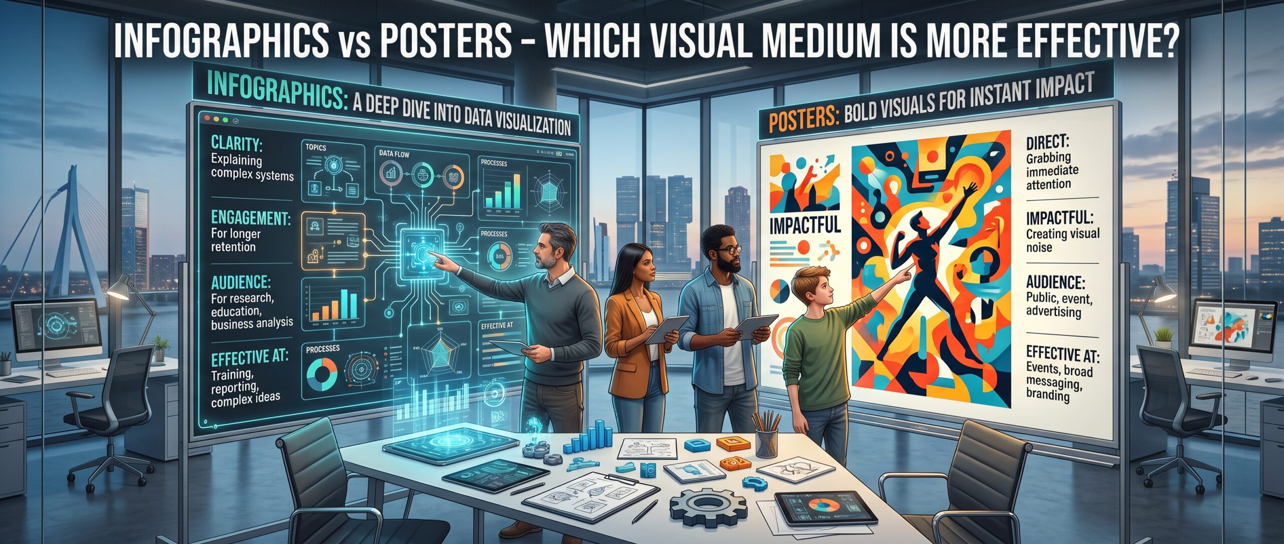
When do Infographics Outperform Posters?
While posters work for simplified messages, infographics really demonstrate their value in communicating detailed insights and complex stories to educate audiences.
1. Telling In-Depth Data Stories
Infographics allow ample creative freedom to translate dry data or research into compelling data stories that engage readers.
You can strategically craft an insightful narrative around the key takeaways, using flowcharts, visual metaphors, maps, graphs and diagrams to represent trends, relationships and conclusions from analyses. Infographics keep the reader hooked even with statistics-heavy content.
2. Explaining Complex Processes or Timelines
Be it an intricate workflow, a historical timeline or a step-by-step methodology, infographics make digesting complex processes much easier through effective visual storytelling.
Creative visual cues combined with concise text can guide users across different stages, events and milestones, allowing them to visualize relationships better.
3. Creating Viral Listicle Content
Infographics are extremely shareable, especially “listicle” style content—posts structured around insights presented in list format.
These data-driven lists and tips help readers quickly extract useful takeaways on popular topics. And when these lists have engaging visuals, they tend to go viral on social media due to the “shareability” factor.
4. Educating Audiences on Complex Topics
Some topics like blockchain, AI and data science can be hard to grasp for non-technical people without losing their interest quickly.
Infographics can make such complex concepts more accessible for mass education initiatives. Illustrations, diagrams, flowcharts and visual metaphors simplify the core ideas effectively.
5. Driving Organic Traffic with Visual Interest
Infographics tend to attract more user attention and links/shares compared to text-heavy blog posts, especially if the visuals are creative and high-quality.
This viral potential translates into increased domain and page authority. Properly optimized infographics drive more organic search traffic over time. They are fantastic for SEO.
Posters rarely see this traction and authority benefits at scale.
6. Brand Building and Thought Leadership
Creative infographics positioned as valuable resources can significantly boost brand visibility and reinforce thought leadership in your niche.
They position your brand as an innovator providing data-driven ideas and insights rather than just advertising products or services. Done right, infographics build authority and trust.
When Do Posters Outperform Infographics?
While infographics allow more room for visualizing complexity, posters shine when it comes to amplifying a singular message with visual pop. The constraints of the medium can be advantageous for certain goals.
1. Grabbing Attention with a Striking Message
Posters are designed to be visually bold in order to quickly grab the viewer’s attention in public spaces. When you need a high visibility aid for a key announcement, campaign message or advertisement, posters get the job done.
Big, vibrant typography and imagery allows crucial information to be consumed at a glance—delivering an instant impression for maximum impact.
2. Promoting Events, Brands or Products
Posters have traditionally been the go-to medium for advertising events, brands and products across contexts—from concerts and movies to FMCG goods and public health campaigns.
The large, visually dominant format works perfectly to increase awareness and memorability for promotional content, especially when strategic placement for visibility comes into play.
3. Communicating Key Statistics and Facts
While infographics also leverage data visualizations, posters distill the message down to only the most crucial statistics and facts.
The constraints of space and simplicity can actually help highlight the core figures more effectively—be it a company’s key achievements or critical health data for public awareness.
4. Reaching Mass Audiences with Minimal Budgets
One of the biggest advantages of posters is that they are still the most affordable print medium per exposure. Mass printing posters with basic designs to reach mainstream audiences and public spaces is significantly cheaper than developing custom infographics.
So when you need to communicate across a city, college campus or a public transit system with a limited budget, traditional posters get more bang for your buck.
5. Complementing Other Awareness Campaigns
Posters are also commonly used to complement other elements of large scale awareness campaigns like social media advertising, TV/Radio commercials, website banners and email newsletters.
They provide additional visibility to key messages that are distributed across other mediums for reinforcing impact on audiences.
So in summary, posters provide visual pop for mass impact…while infographics visualize complexity for an in-depth education.
Best Practices for Developing Better Infographics
Now that we’ve compared the two mediums let’s explore some best practices for developing engaging, high-quality infographics.
Choose Quality Over Quantity with Data Visualizations
The foundation of a great infographic lies in the precision and relevance of the data visualizations. While you can use various graphs, charts and diagrams, ensure quality over packing quantity.
Strategically identify the most insightful datasets and focus on visualizing them effectively. Don’t overwhelm the reader.
Use Concise Text and Get to the Point Fast
Every text element must pull its weight by communicating ideas clearly and efficiently without wasting words. Write in an engaging yet scannable style optimized for skimming value.
Carefully Balance Text and Design Elements
Getting the balance right between text and visuals is key—too much text diminishes the power of visuals…too many distracting graphics overwhelm the key message
Map the User Journey for Seamless Flow
Carefully guide readers through different infographic sections using visual cues, color coding and transitions that make the journey intuitive. Well planned flow and layout separates high-quality infographics.
Choose Colors, Icons and Typography Strategically
These visual elements can make or break user experience. While creativity in infographic design is important, ensure visual consistency and cohesiveness in choices.
Best Practices for Poster Design
While infographic design requires storytelling finesse, poster design focuses on visual pop and graphical hierarchy executed tastefully. Here are some key best practices:
Lead with Dominant Visual Imagery
Leverage size, contrast, negative space and strategic placement to create strong focal points using photos, illustrations or graphic elements. Dominant imagery amplifies impact.
Establish Clear Hierarchy with Titles
Use your brand name, campaign title and messaging headlines prominently. Typographic hierarchies help guide attention in order of importance.
Align Elements Strategically
Carefully align text, logos and design elements using established grid principles. This enhances presentation and visual flow. Strategic use of white space also helps.
Make it Scannable
Poster content must be readable and scannable at a glance. Use consistent fonts, sufficient size and spacing between elements to facilitate visual scanning.
Keep it Simple and Consistent
Visually complex posters fail to deliver clarity. Stick to a minimalist style with sufficient contrast between vibrant and neutral elements. Consistency in style also keeps it cohesive.
So in summary—leverage visual contrast, typographic impact and strategic information hierarchy.
Summing it Up
Infographics and posters cater to different goals through tailored formats. There’s no one size fits all rule.
Infographics visualize complexity for an in-depth education using:
- Data Storytelling
- Process Flows
- Creative Visuals
Posters grab attention powerfully with a singular message using:
- Visual Pop
- Simplicity
- Memorability
So leverage the medium that best aligns with your goals and audience needs.
At the end of the day, the most effective visual content keeps users engaged, informs them AND drives the outcomes you need. With strategic thinking and some creativity, both infographics and posters can help you hit the mark!